

![]()
![]()
The 3 Dimensions of Color
Color performance is not well understood by the general public, and even magazines aimed at home theater enthusiasts often get it wrong.
The color performance of any display is measured in three ways: the grayscale, the gamut, and the luminance of the colors.
The Grayscale
This is the measurement you see most often cited in reviews. Gray scale is commonly measured as a +- color temperature deviation from 6505 degrees kelvin across a specified range of output, which is usually presented in % video, say 10-100%. This roughly corresponds to about 0.6%-100% of the display's available light output. Results lower than 6505K mean that the display's color temperature suffers from excessive red, while results above 6505K mean that the display's color temperature suffers from excessive blue.
This is fairly easy to understand, but it is also a little misleading. Measuring grayscale in Kelvin ignores green, so a display could have an appropriate balance of red and blue and thus measure near 6505K, but suffer from a severe excess or deficiency of green. In such a case, the image would look awful. A better measurement is Delta-E (dE or ΔE), which is a mathematical measurement of the degree to which a color deviates from an established reference. Neutral gray, which is sometimes referred to as D65, has a very specific definition of 0.3127, 0.329. These are xy points on a standard graph that presents color performance in a 2-dimensional space. The dE of white throughout the entire grayscale should be no more than 3.0.
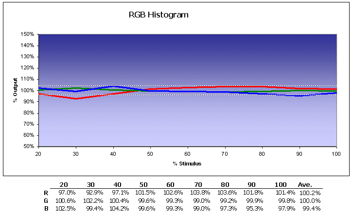
Another way of representing grayscale performance is with a RGB histogram. Since white is simply the combination of all colors and all color is merely combinations of red, green, and blue, neutral white is achieved when there are equal mixes of RGB. This can be easily plotted on a chart that shows how the mix of RGB changes throughout the grayscale. The closer any point on the grayscale is to to a perfect blend of 100% red, green, and blue, the more accurate the color of white at that video level.
The counterintuitive aspect of calibrating a display's gray scale is that you are actually trying to remove as much color as possible. It is only when the entire range of luminance is a completely neutral gray without any color contamination that the display will present ONLY the color provided by the source. Otherwise, the display introduces its own color cast to the image, which can make it look very unnatural.
The Gamut
Grayscale tracking is a very important part of the calibration process. However, it is not the only aspect, because there are other parameters of display performance that we need to take into account.
In particular, we should strive for a display whose RGB primary colors are correctly defined. Every display has a gamut of primary and secondary colors. Ideally the colors in that gamut will correspond to the color definitions used in the production of source material (broadcast, DVD, and Blu-ray). If the producers of content use one color palette and the display on which that content is viewed uses another, then the resulting image will appear unnatural. The goal of calibration is to adjust any inaccuracies in the gamut so that the source and the display represent the full range of visible color according to the same standards.
Unfortunately, although virtually all displays offer a method to correct inaccuracies in the grayscale, only relatively few offer the ability to adjust the gamut of primary and secondary colors. For this the display must include a properly functioning color management system (CMS). The good news is that manufacturers seem to have gotten the word and more and more displays either offer a CMS or a reasonably color-correct preset.
The most common way that the gamut is represented is through a triangular-shaped chart, known as a CIE chart, which is shown below. CIE stands for Commission Internationale de L'Eclairage or "International Commission on Illumination". This organization sets international standards for color reproduction.
On this chart the colored, tongue-shaped area represents the entire spectrum of visible color. The triangle inside represents the gamut used for high-definition programming. As you can see, the gamut used by content developers is considerably smaller than what the eye is capable of seeing. However, there are wider gamuts that use more of the available color space, such as the gamut used by the Digital Cinema Initiative. However, this gamut is not used for the development of content intended for home viewing, so it should not generally be used as a calibration target.
The further measured colors deviate from their intended points on this chart, the less accurate the gamut.
These colors have very specific definitions.
Rec. 709 High Definition |
||
x |
y |
|
| Red | 0.640 | 0.330 |
| Green | 0.300 | 0.600 |
| Blue | 0.150 | 0.060 |
| White | 0.3127 | 0.329 |
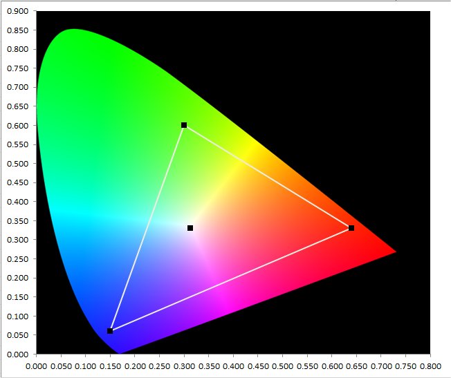
There is one profound weakness of the CIE chart. It only describes color in a two-dimensional plane. The problem with this is that color is a three-dimensional property. For this reason, the CIE chart alone is insufficient to describe the gamut of your display.
The 3 Dimensions of Color
Saturation: This is the colorfulness of the color independent of its luminance. It is the redness of the red or the blueness of the blue. An undersaturated red looks washed out, whereas an oversaturated red will appear as a deep crimson. Saturation is depicted on the CIE chart by the distance of the color from the reference white point at the center of the triangle. If a color is too close to white then it is undersaturated. If a color is too far from white and closer to the outer boundary of the gamut, then it is oversaturated.
Hue: This is the property that distinguishes one color from another. A red whose hue is inaccurate will take on a purplish or orangish appearance. Hue is measured by the angle the color appears on the CIE chart from the reference white point. So as hue changes a color moves around the white point.
Luminance: The luminance of the color is literally how bright it is. This is the characteristic of color that is not depicted on the CIE chart at all. Thus, we need some other method to portray this. A standard bar chart is well suited for this task.
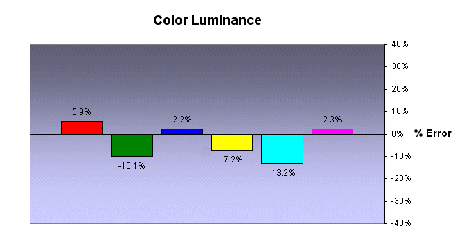
The luminance of the color is not a fixed property like xy coordinates on a graph. The xy coordinates can be used to describe the saturation or hue of a color, but not its luminance. For that, we use the uppercase Y symbol. The luminance of any color is generally understood as a proportional relationship. Specifically, it is relationship between the luminance of the color and reference white at the same level of stimulus. The established HD reference for this is:
Rec. 709 High Definition |
|||
x |
y |
Y |
|
| Red | 0.640 | 0.330 | 0.2126 |
| Green | 0.300 | 0.600 | 0.7152 |
| Blue | 0.150 | 0.060 | 0.0722 |
| White | 0.3127 | 0.329 | 1.0000 |
Thus, any color can fully specified by its xyY value, which will provide its saturation, hue, and luminance.
To sum up, each color has three characteristics: saturation, hue, and luminance. Furthermore, every calibration should include three types of color calibration: the grayscale, the gamut, and the luminance of the colors.